 Let’s face it. If your emails or blog posts are not ‘readable’ enough people are not going to read it. You’re basically wasting time writing them. If that is you then you are missing out on subscribers and customers.
The impact of readability is highly underestimated. You get an instant advantage if your blog is more readable then those of your competitors.
Getting visitors is one thing, getting them to do something (like reading) is another. Getting visitors alone is not going to get your website rank higher.
You need your visitors to do three things in order to get a good website ranking and making your blog or emails more readable is going to help a lot.
What you want your visitors to do
1) You need them to stay on your website for a while
The longer they stay and the more posts they read the better it is for your website ranking. People that leave right away are added to your ‘bounce rate’. A high bounce rate is not good.
2) You need them to come back.
The more they come back the better it is for your website ranking. It all ties in with the user experience I wrote about earlier.
3) You need them to share your content.
Would you share an ad packed ugly webpage yourself? That’s a rhetorical question. It sure would make the decision easier to share if the webpage was very readable.
What is readability?
WikiPedia gives the following definition:
Readability is the ease with which text can be read and understood.
What that means is that readability defines how easy it is for people to read and absorb your post or email. This sounds easy but there is a lot of psychology involved here.
There are some psychological effects working against you if your posts are not ‘readable’ enough. I’ll go into more details about that below
What you should know about visitors
Keep these two points in mind when you read my recommendations below.
1) Visitors are usually only interested in information
That is probably the reason why they arrived at your webpage or why they decided to open up your email. They want answers and they want them fast. Anything that stands in between your visitor and the information they want is an obstacle. Obstacles are reasons for your visitor to click away from your website.
2) Visitors are looking for a reason to leave your website
Everybody is overloaded with useless information these days so their ‘this-is-useless-radar’ is working on full strength.
That means that if they can find anything at all that gives them an excuse to leave your blog, they will do so.
This is fact. Slap your readers in the face with non related ads, a big logo and other distracting things, when all they want is some information, and chances are that they will leave your website looking for more readable ones.
10 Steps to make your blog or emails more readable
 There are some very simple rules, tested time and time again, that make all the difference for the readability of your blog or emails. I’ll mostly talk about a blog/website below but the same rules apply to emails.
1) Your blog must have a small header
This is the part of your blog where you would normally put your logo or blog name. Why should it be small? Because you want your post to be visible the moment a visitor opens up your blog.
Why waste that valuable screen estate to graphics and other stuff they are probably not interested in? It creates one more reason and opportunity to leave your blog.
Whatever you put in your header, like a logo and a tagline, keep it small, short, simple and to the point. That is easy to digest and the visitor will have instant feedback that confirms they came to the right place.

2) Use dark text on a light background
There are several reasons why you should use dark text on a light background.
For one thing, ‘paper like’ posts gain more trust. If you use light text on a dark background you will lose more visitors. Reading is more difficult and the color scheme is often associated with shady topics like gambling.
Also, when your monitor is emitting more light the iris is a bit more closed, decreasing the effect of a deformed lens. In plain English: a lighter background results in a more clear (sharper) picture which makes it easier to read the characters.
Can you read the smallest font size in the picture below for each of the color schemes?
3) Use a readable font / font combination
This is without a doubt the most debated point of this list. There have been many studies to determine which typeface is best. In particular whether you should use a ‘serif’ or ‘sans serif’ font for your post.
There is no clear conclusion so the best thing is to try it yourself and see what works best for your blog.
I like ‘sans serif’ fonts best for blogging websites but that is personal. A Microsoft research report seems to support my opinion though; their sans serif font is performing very well in legibility compared to other (MS Windows) fonts.
Also note that fonts (typefaces) affect how people accept information. Depending on what you are trying to achieve you might want to select an appropriate font.
The guys from StudioPress (renown theme builders) make these 5 recommendations.
The takeaway is that you should stick to just a few fonts that make a good match. Don’t use more then 3 different fonts on your webpage (I use two) and make sure they are easy to read.
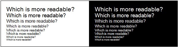
4) Make the font size at least 16 pixels high
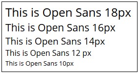 You think that’s big? Right now you are reading an 18 pixel Open Sans font. You could argue about the best size. Some say it is 14 pixels, others say it is 20 pixels.
I personally like 18 pixels height for this font and would certainly not go below 16 pixels height.
What most people don’t realize is that screens are getting smaller (tablets and mobile phones). The moment someone has to bend forward to read your post you have two things working against you.
a) Any extra action(s) needed, like zooming in, are also break points. This is where your visitor may decide to move on and leave your website.
b) When you bend forward you tension the muscles in your neck. This ‘cramped’ feeling is unpleasant and might make your visitor leave sooner, if not right away.
When someone reads your post you want this person to be relaxed. That way they can take the time to read and digest your post.
This is to some extent also discussed in my ebook Smarter Affiliate Success Secrets where I talk about emotions and how they affect the decisions your visitors make.
5) Leave enough space between the lines
With this I mean the space between lines within a paragraph. If lines are packed together it will take more effort to keep the lines apart when reading. Again, the extra effort needed will make your visitors leave sooner.
This effect becomes more important if the lines are getting longer. The longer the lines the more line space they need for us to perceive them as easy readable.
A ‘line space’ of 130% or more is recommended. So if you use a 16px font make your line size at least 1.3*16 = 21 pixels (approx).
6) Keep your lines short
This is another topic of debate. Some research suggests it should be between 9 and 12 words for left aligned text. Others say the line length doesn’t really matter that much.
You already know you should probably use short subject lines but what about the body text?
Again psychology plays a role here. It seems that shorter lines energize the subconscious mind. At the beginning of every new line the reader is focused, but this focus gradually wears off over the duration of the line.
Very long lines are much harder to oversee and that means they are harder to grasp.
Shorter lines require less eye/head movement again making it easier for your visitor to read your post. But don’t make your lines too short. Very short lines means the reader will have to jump all the time from one line to the next, which also costs energy.
In addition, your paragraphs will become longer (vertically) if you do which makes it harder for the reader to navigate your page. More about that in point 8 below.
Personally I’d recommend about 3x the alphabet at most. That is around 80 characters if you do the math. It just seems easiest to digest.
7) Make sure the colors you use are easy on the eyes
Squinting is the last thing you want your readers to do. Again this creates tension and a visitor will feel uncomfortable. Not good.
A pleasant side effect of using a friendly color scheme is that you can make your Call To Action fields (CTA’s) stand out more easy. Give them a vivid color and half the work is done.
Also note that colors are related to emotions which can be different per culture. The meaning of a color is also closely related to the context the color is in. But what seems to stand out is that the more vivid a color is the stronger it is associated with emotions.
8) Keep paragraphs short
Feel free to use blank lines whenever a paragraphs is about to exceed 5 lines. Making smaller blocks of text makes it easier for your visitor to keep track of where he is.
The blank lines have another important psychological purpose; it gives the reader a resting point. Just a moment to catch another breath of air before reading the next few sentences.
You might have noticed that I use plenty of white space in my posts. Now you know why.
9) Use relevant images
An image says more than a 1,000 words. I hardly use images in my emails because of delivery issues but on a website/blog it is another story.
Images make it easier to digest the info provided the image is relevant.
Whenever the use of an image strengthens the point you want to get across use one. Don’t overdo it or else it will look like Instagram.
10) Publish content for an F-shaped reading pattern
Did you know that the average reader digests your webpage in an F-shaped pattern? They’ll read the title first. This is also the part of your page that will get the most attention. Fail to write a good title and you lose visitors, no matter how well you crafted your content.
They quickly glance over the first paragraph. Is this article worth reading? Note that at this point they are still not really reading; they’re merely glancing over the content.
Then they move on to the next part of the article. As you’re visitors move on down the story you’ll start to lose more and more of them.
This means you should put the most important information in your first two paragraphs because that determines to a great extend if the reader will stick or not.
Make sure that sub headers make it very clear what the following paragraph is about.
It is also a good idea to align your text left. It reads more easily and it fits better in the F-shaped reading pattern most readers have hard-coded in their brains.
I really hope this article will help you improve your blog or emails. If you made it this far I thank you for sticking with me!
[hcshort id=”8″]
Right now it appears like Movable Type is the best blogging
platform available right now. (from what I’ve read) Is that what you are using
on your blog?
No, I use WordPress for this website. I’m working on a resource page that will outline exactly what I used to build this website. It should be finished soon so do come back again if you want to know more.
I love reading through a post that can make people think.
Also, thank you for permitting me to comment!
Thanks 🙂
Interesting tips, I knew some of them already but using a very small header and the f-shaped reading pattern hadn’t really crossed my mind, so thank you.