 If you are building a mailing list, you are also probably using landing pages. If not, then you should.
Landing pages are extremely useful tools if constructed properly. A landing page is where your visitor ‘lands in’ after he has clicked a link in an ad for example.
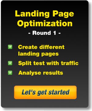
Landing page optimization is the key to getting the most out of your landing pages.
In this email I’m going to share the results of the first split test with three completely different landing pages. I used these landing pages as ‘squeeze’ pages. I want to get the email address of the visitors.
In exchange I offer the visitors free tips and my eBook “Smarter Affiliate Success Secrets”.
I then send over 25,000 visitors through an ad to these landing pages to see which performed best.
If you are familiar with split testing, I can hear you thinking right now; ‘completely different landing pages?’
Yes, completely different landing pages.
This is a somewhat unconventional approach to optimizing landing pages, but I think it is a good way to get started. I’ll explain why in more detail further down this page.
Landing page optimization versus tweaking
The majority of the articles you’ll read about split testing online are actually more about ‘tweaking’ landing pages. The unspoken assumption is that you already have a landing page that needs optimizing.
Writing this post, I’m not in that stage yet. One of the things I learned over the years is that it’s best to have an open mind when it comes to testing new things and tweaking the old things. It can be quite difficult to crawl inside the heads of your average landing page visitors.
Split testing 3 different landing pages
Enough said. Meet the three contestants for test run #1.
Landing Page number 1
After reading a dozen articles about landing pages and examining the existing ones, I decided to craft this after an example provided by ViperChill on his blog. He makes some excellent points about building a landing page, including adding ‘magic grass’ (go and click on it and see what happens), so that makes it a perfect testing material.
Here is an example of what it looks like.
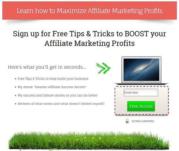
You can find my version of landing page #1 here if you’d like to test it.
Landing Page number 2
I purchased a great WordPress Plugin called HybridConnect (aff link), and I used it on almost every page of my website. This is a great tool for creating landing pages / squeeze pages. I created several versions, but actually below is the particular version I used for this test. I converted it into a stand-alone version.
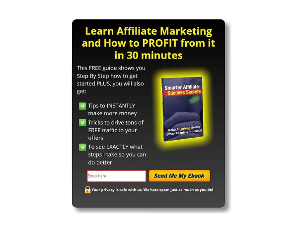
You can find my version of landing page #2 here if you’d like to test it.
Landing Page number 3
Contestant number 3 is a hand crafted landing page that I purchased as a gig ($5) on Fiverr. I purchased a actually a few, from different sellers, just because they all promise the highest conversions. I picked one that contrasts nicely with the two contestants you see above.
Here is what it looks like.
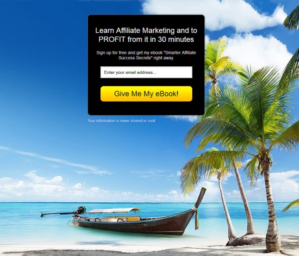
You can find my version of landing page #3 here if you’d like to test it.
Now let’s see how smart you are my dear reader 🙂
*** Which landing page do you think scored best and why? ***
I’ll give you the answer below.
Why split-test completely different landing pages?
I learned in one of the training I followed as a dance teacher that people can be roughly divided into three categories. They are either primarily visual, auditory or kinestheatically orientated. I could write several blog posts about this subject and how important it is that you understand this phenomenon, but that is outside the scope of this post.
Most people are visually orientated
What matters is this. Most of the people (about 70%-80%) are visually orientated. They are most sensitive to visual information. I think, although I can’t prove it, that even a higher percentage of my website visitors are visually orientated. After all, ‘browsing’ the internet is primarily a visual activity isn’t it?
Build your landing page for visually orientated people
Here is how, I think, this affects your landing page conversions.
- Your landing page has to look good. If it looks bad, your visitors will not take it seriously and will leave right away.
- Visually orientated people will only glancie over your landing page because they don’t like reading. Reading means focusing on part of your webpage and they just want to see it all. In other words; hit them with too much text and they will leave your page without taking any action.
- The benefits for the user must stand out, which means and they must be short and straight to the point.
- Your Call-To-Action must stand out. Big time!
This is only a hypothesis so I still need to test if text really matters that much.
Why I picked the three landing pages above
The three landing pages above are very different. I haven’t bothered too much with the text yet (I will in a follow up post). Pay attention to the visual differences between the three contestants.
Landing Page 1 analysis
This page is visually appealing (I think). I changed the colors to match my website.
ViperChill says in his tests using the image of a laptop worked better than showing a picture of an eBook, DVD or CD. Although he changed the screen of the laptop to show a relevant image to his offer, I didn’t. I wanted to see how this page performed without a relevant image.
Keep in mind that a laptop by itself is somewhat relevant to my offer although, indirect. Free tips & tricks obviously will be delivered through the internet and read on screen.
The magical grass at the bottom is not relevant at all but according to ViperChill it doesn’t make a huge difference what you put there as long as you put something there.
Landing Page 2 analysis
There is more text in this page and a cover picture of my free ebook. That is what they are getting, and so it is relevant. I even made it completely stand out so it has to catch attention. I want my visitors to see they are getting this eBook.
There is no background here; I only wanted to show the box. The box has a drop shadow to create the illusion that it stands out from the background.
The CTA button says, ‘Send Me My Ebook’. If there is one line of text that does get read on this page, it is probably the one on the button.
There are only 3 bullet points here, as opposed to the 4 bullet points on the previous landing page.
Landing Page 3 analysis
This is the only page with a background picture. It is not relevant to the offer but the idea is that this picture puts people in a relaxed, vacation like mind set. Happy days are awaiting them if they sign up. It is supposed to work mostly unconscious.
The opt-in box itself does not have a drop shadow and the text is very short. I do not mention Tips & Tricks on this page.
Note also that I did not put a lock symbol in the privacy statement right under the box.
The traffic
I purchased 25,000 impressions on Neobux for $38. The impressions were divided equally over my three landing pages. I ended up receiving 25,013 visitors. The ad looked like this:
<my URL rotator link here>
Neobux (aff link) is a PTC (Paid To Click) website. People are earning scraps for clicking on my ad. The advantage is that clicks are relatively cheap and for just testing the conversion rate of a landing page these PTC visitors are fine. I’m not testing the ad itself; I’m only testing how well my landing pages are doing.
The Results
Here is how my landing pages scored.
Landing Page #1: 6 signups
Landing Page #2: 18 signups
Landing Page #3: 7 signups
It is obvious that landing page #2 is the clear winner in my test. The big question is why?
I can only guess but I’m assuming that the empty background forces the visitors to focus on the box. The boat in version #3 is distracting. Not good.
Note that the box is very compact. All information is crammed into the box, as opposed to landing page #1 where the text is spread out over the entire page making it more spacious. At the same time it gives the impression of having more text to read and that is a turn off for visually orientated people.
What jumps out in #2 is the picture of the eBook. The words that stand out on the ebook cover are ‘Success’, ‘Secrets’ and ‘Fortune’. Although they are in fact text, they are also very visual. I think that a visitor will perceive this text as a visual object and is not turned off by it.
The title in the box makes it clear they will be learning Affiliate Marketing and make a profit with it. The CTA button confirms they are getting that eBook.
The rest of the text throws the word ‘free’ a couple of times at them. ‘Tips’ and ‘Tricks’ always do well.
My guess is that if I leave the eBook cover out of this form, it will perform worse. I would have to (and will) test that of course.
Considerations
ViperChill mentioned in his blog post that having some sort of graphic underneath your landing page seems to work well. In most situations the visitor already has a task bar under the landing page. There is something there already. Maybe adding the magical grass right on top of the task bar works counter productive. This would have to be tested.
My visitors were not targeted at all. Different niches have different customers with different needs. I imagine that for certain niches you would need a more tailored approach. For example, if I would have to create a landing page for the weight-loss niche, I would want to stir up a strong emotion. Show a model with a flat stomach or something to make them ‘want’ the product or information to become like that too.
There are more variables to consider like demographics, different browsers and the time frame in which the ad was run (it took less then 3 hours to get these visitors). For the sake of simplicity I’m not looking at these variables right now. I might later.
Conclusions
These are preliminary conclusions which serve as a starting point for further testing.
- Having a complete empty background seems to work best. The lesser the distractions the better. You want the visitor to be (forced to) looking at the important information.
- Don’t be too spacious with the information you are presenting. Make it easy for your visitor to oversee everything.
- Make your landing page visually appealing. If you’re giving away an eBook, show the cover. If you have used some ‘power’ words on your cover, then make them stand out. It is text but I think they are perceived as visual objects.
- A drop shadow makes the entire box stand out from the back ground making it even easier to focus on the box.
- Using a lock symbol right in front of your privacy statement reinforces the promise that your visitors’ personal details are safe with you.
More to follow.
[hcshort id=”8″]